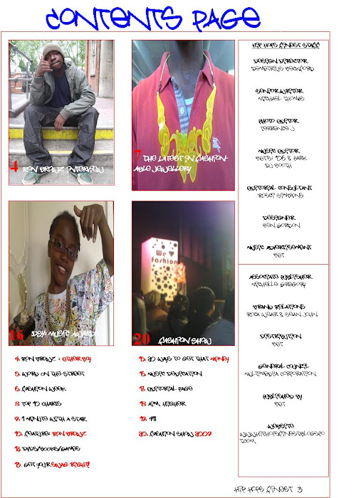
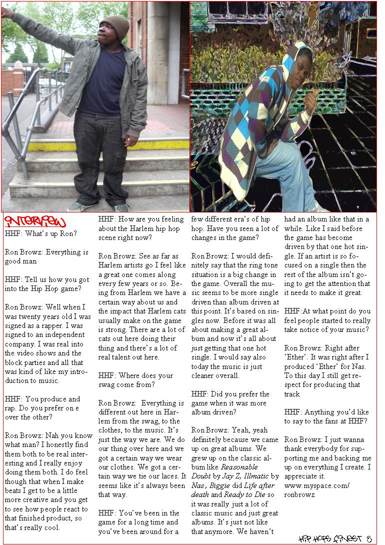
During my free time I focused on the first page of the contents page and chose appropriate pictures that would convey what content the magazine consists of. The idea of having a
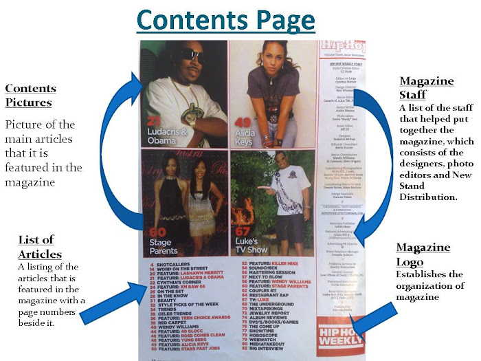
contents page sheet came from doing research on varoius magazine's, this led to me recognizing the stlye that a magazine chose for the contents page. Having a double speard sheet gives the reader a visual view of what exaclty is in the magazine as well as the second page having a list of articles. I adapted the idea into my own and imported pictures of my own onto the page. I specifically focused on what the pictures would look like and who would be in the pictures. I done a balance of having male artists and female artists so that it would present a balance of genre. I also chose to have the most successful male and female artists on the page as it will attract the audicence more affectively.
The colour scheme is consistent in the first and second contents page, the purpose for having the colour scheme is to establish a housetyle colour theme so that it's recognisable for the readers. As well as building a memory *Hip Hop Finests* dominant colours.
See Ya Soon, *Beckford23*
Friday 27 March 2009
Wednesday 25 March 2009
Housestyle
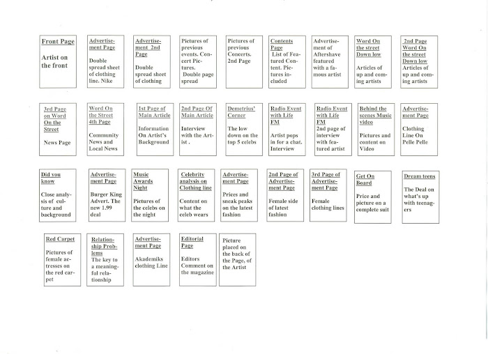
My contents Page will be a double page speard sheet with pictures of the featured articles on the first page and the second page will be content listings along with the *HHF* staff being listed on the side. The theme colours of my magazine are red and blue, and will be consistent throughout the magazine.
I will continue to work on my contents page and keep the housestyle the same throughout.
See Ya Soon, Beckford23
I will continue to work on my contents page and keep the housestyle the same throughout.
See Ya Soon, Beckford23
Tuesday 24 March 2009
Making the Magazine
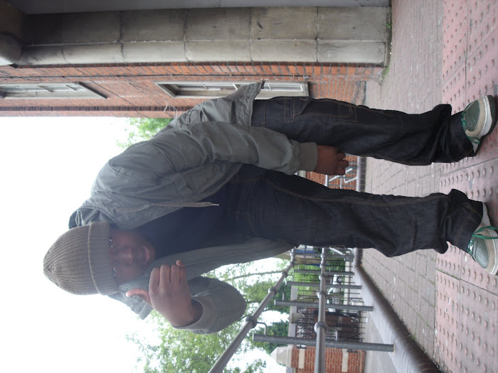
During my lesson I used my photos that I took and used Adobe Photoshop Element 5.0 to enhance my contents page picture. By making the background black and white that bought a main focus on the person. Next lesson I will continue to enhance other pictures that I have taken.
See Ya Soon, Beckford23
See Ya Soon, Beckford23
Thursday 19 March 2009
Front Page Drafts
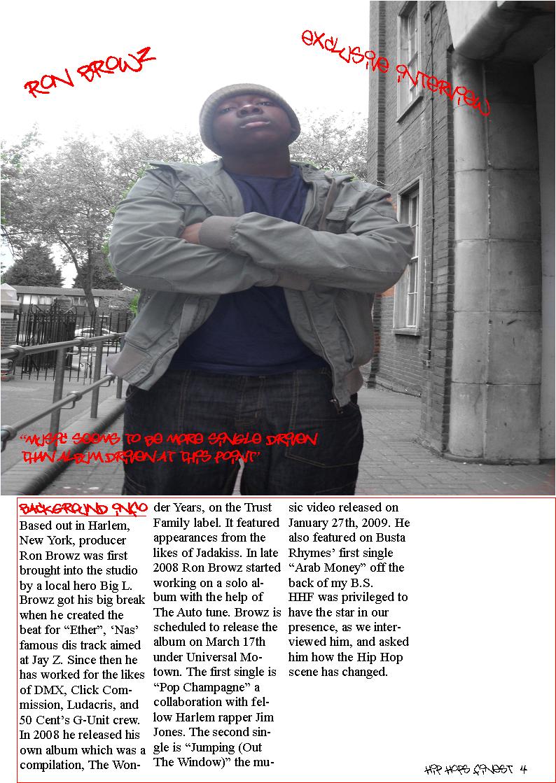
During my lesson I began to draw out pages of my magazine to see how the layout would look as well a deciding what content I would show on the front cover and contents page. The colour that I chose for the magazine is red and blue and will be a consistent housetyle theme featured in the magazine. The pages with the most infromation will be the double speard sheet which will consist of background info on the artist and a exclusive interview about his new upcoming album.
After the drafts are done I will begin to work on the making of it and follow the design that I layed out in the drafts.
See Ya Soom *Beckford23*
After the drafts are done I will begin to work on the making of it and follow the design that I layed out in the drafts.
See Ya Soom *Beckford23*
Tuesday 10 March 2009
Advertising and Editorial Pages
During my lesson I analysized my Magazine and took note on how many pages consisted of editorial content and advertisement material. I realized that there was more advertisement pages than editorial due the immediate promotion of clothes, Aftershave and trainers. Half way through the magazine the content became more editorial since the main article was the main focus. I will put this into consideration when producing my magazine.
See Ya Soon, Beckford23
See Ya Soon, Beckford23
Monday 2 March 2009
Strengths and Weaknesses Of a Contents Page
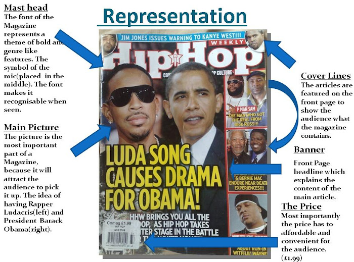
During my lesson I was given two different contents pages of a magazine, and instantly realized the differences. Both showed the same theme of colour coordination, however differed when it came to the layout. The Magazine called *Kingsize* looked more simple but with purpose and featured good quality pictures which helped to show each of the photos individuality. Whereas the other magazine has photos which didn't quite portray enough of meaning, although was the structure to the layout was good. I seemed to like the *Kingsize* magazine better because it was simple and straight forward and immediately gave me an insight on the kind of genre it was, as well as a character of who might buy it.
In conclusion, I am getting a strong understanding of how a contents page should look and what it should convey to the audience. Another thing to consider would be the colour code of the magazine and layout of the front page and contents page. It's important to consider whether of not it will look eitheir to complex or the contents page looking more like a magazine when in shouldn't.
I found that both lessons was most informative and gave my knowledge a wider view of magazines and how they should look e.g. *Housestlye*.
See Ya Soon, Beckford23
Subscribe to:
Posts (Atom)