Wednesday 15 September 2010
Friday 1 May 2009
Survey Analysis Of Questions
During the process of making the magazine I handed out questionnares with information on what kind of content should be in a music magazine.
After recieving those questionnares back, I have come to the conclusion that the majority of the people wanted exclusive interviews, upcoming albums and latest in fashion. From this information I gathered I understood the demands of what should be featured in a magazine and applied that in Hip Hops Finest. The questionnare raised awareness on what's important in a magazine such as providing content that is exclusive as well as fresh to the audience. In addition, I feel that I have taken into consideration and included the content
See Ya Soon *Beckford23*
Friday 17 April 2009
Evaluation of the Music Magazine
In what ways does your magazine use, develop or challenge forms and conventions of existing music magazines?
Hip Hops Finest is a music magazine that is heavily influenced by other magazines such as XXL, Hip Hop Weekly and The Source. When researching music magazines I showed a specific focus on the Hip Hop Weekly and XXL. They both shared the same genre of music, however had different conventions portrayed on the front cover and throughout the magazine. For example, Hip Hop Weekly immediately gives the appearance of addressing a more lower age group target audience due to the bright and bold colours of the font and title. Another feature that made it appear this way was the quality of the paper as well as not having the glossy finish that XXL commonly use. The target audience of the Hip Hop Weekly magazine would be aimed at 14-16 years old, which share a brief interest in Hip Hop music. An additional feature that the Hip Hop Weekly magazine shows is the price of the magazine, which is an affordable £1.99, making it very accessible for the audience. The convention that I was able to gain from Hip Hop Weekly was the dominant font of that the title was in. The bold font immediately illustrates the genre of Hip Hop which is greatly reinforced by the microphone placed in the centre of the words Hip and Hop. Hip Hops Finest was mainly influenced by XXL as it represented a more professional and mature insight on Hip Hop music. The appearance of the Front Cover directly gives the impression of a mature audience which is apparent in the house style throughout the magazine. XXL targeted audience are aimed at social groups starting from the age of 17-21, with a balance of girls and boys. I instantly was able to acquire the style of XXL, and adapt it to the Hip Hops Finest magazine with my own additional style added to it, to make a unique magazine. Hip Hops Finest developed its house style by analysing XXL’s professional look and Hip Hop Weekly’s style of font. Hip Hops Finest does challenge certain forms of conventions that are present in most music magazines, where the background is usually blank or has a corresponding colour. I chose to leave the background with the picture as it complements the picture and the front cover. A further reason why I kept the background was because it gave a symbol of hip hop culture, as some pictures of artist are sometimes taken outside a significant building.
Hip Hops Finest has the appearance of a professional look consisting of a professional font for the mast head, a bold and dominant style for the sub-headings and the cover lines. All these elements combined into one magazine greatly achieved a professional look, as well as a mature insight on hip hop music.
How does your music magazine represent particular social groups?
Hip Hops Finest is a magazine that has a specific focus on hip hop music, culture, lifestyle and celebrity gossip all in one magazine. To support the hip hop genre, the front cover had to convey a very urban and hip hop scene. To this I had a picture taken of myself, where I was posing like an artist with a urban background in the back. The pose I took was a slightly leaned forward posture with my hand symbolizing a symbol of a musical group called ‘Skull gang’. The idea of having myself on the front cover, clearly emphasizes the kind of social group that would be interested in the magazine. The fact that I appear to be wearing trendy clothing, with a hip hop influenced posture, as well as the symbol made by my hands, greatly represents what kind of target audience I am attracting. The magazine also contains a house style of an advanced graffiti font for the title, the theme colours being a basic red and blue and the cover lines having a basic white stylish font. An additional way that the magazine represents a particular social group is the culture that is displayed throughout the magazine. Throughout the magazine, the majority of the artists are young and successful, which portrays a fresh urbanity to the audience. The impact of having young celebrities and artists featured in the magazine is important, because they are the social groups main influence of fashion, music and lifestyle.
Lastly, Hip Hops Finest represents a specific genre is the use of technology that is available to the audience. With the new technology of social networking sites such as Face book, My Space and Twitter being a new way to communicate, Hip Hops Finest appeals to the audience due to the fact that it will be advertised on those sites for maximum recognition.
Who would be the audience for your music magazine?
Hip Hops Finest is a magazine that is aimed at a balanced target of young black urban teenagers from the ages of 17-21 years old. It is heavily influenced by young black culture, however does still contain content that is suitable for other ethnic groups. The targeted audience’s lifestyle will be reflected in the magazine as it consists of socializing with friends about celebrity gossip, partying, sports and fashion. Another aspect that these urban teenagers are likely to have is a part-time job, which would mean that they will be earning their own income. The price of the magazine is £3.25 which is affordable for teenagers based on the fact that most teenagers have part-time jobs. The language and imagery used in Hip Hops Finest is evident that they will have a interest in hip hop music. Hip Hops Finest consists of articles and interviews with a medium sized text which is a diversion from other music magazines that have a large amount of text. Another feature that highlights the type of audience is the use of language that is utilized to address and attract the audience. Hip Hops Finest has a contents page which features the word ‘swag’ which is a commonly used word said by most teenagers. The effect of using phrases such as ‘swag’, gives the idea of the teenager feeling connected to the text, as well being familiar with the popular phrase. Hip Hops Finest will interest teenagers who follow young and dominant hip hop artists, fashionable clothing such as yumsshoes etc, and deeply engaged in social networks such as My Space and Twitter.
What kind of institution might distribute your music magazine and why?
After researching various distributors of music, it came to my attention that the corporation BET( Black Entertainment Television) would be best to distribute Hip Hops Finest as a magazine. The reason why I chose BET is because they are a very successful company that distriubutes hip hop music on through music magazines like XXL, Word Up and Black Beat. BET represents youthfulness of black culture and the strong influence that hip hop music has on teenagers. BET is also established throughout the whole of America and the UK, with many recognitions. With BET distributing my music magazine it would mean that it will be in special music shops that sell music magazines such as HMV and VP Records. Shops like HMV are visited by many hip hop fans, which would result with them buying copies of the magazine.
How did you attract/address the audience for your music magazine?
By conducting a questionnaire about music magazines I was able to get feedback on the good points on what makes a good magazine. The majority of the teenagers thought that a music magazine should come out monthly as this would mean that there would be more content featured in the magazine. Another aspect that I had to take into consideration was the featured content placed on the front cover, as it would determine whether or not, it addresses the audience. The freshness of the musical content was another issue that most of the teenagers highlighted as a good feature in music magazine. In Hip Hops Finest, the latest in clothing and music is all featured in the contents page and articles. Hip Hops Finest addresses the audience in both a formal and informal way when necessary, for example in the contents page it has a formal presentation. Whereas the front cover has a mix of both formal language and informal language such as the word 'swag'.
In conclusion, using similar conventions as XXL and Hip Hop Weekly, I was able to attract and address the audience the targeted audience by utilizing the use of artists body language, fashion and new trends in clothing.
What have you learnt about technologies from the process of constructing this product?
During the construction of the music magazine, I learnt the importance of house style as well as a consisting theme of colour throughout the magazine. I learnt how to use Adobe Photo shop Elements 5.0 for editing pictures, and Microsoft Publisher 2007 to put in the columns of the text. I was comfortable using the Photo shop to enhance my original photos and found that by using Microsoft Publisher 2007 I was to able to give the magazine a professional look and finish. I also learnt the importance of taking quality pictures with a camera, so that when they are put in the magazine it will look professional.
Another aspect of this course that I acknowledged was the use of posting the work onto a blog site which helped to enhance the work even more. In addition, using blog spot.com raised the awareness of how effective the Internet can be when posting work on your own blog. Using blog spot.com made it accessing the work easier, as it meant that I could work on my blog from home as well as school. I personally feel that blog spot. com is a good and efficient way to keep up to date with your work along with the idea of being able to display your work for others to see and even share a comment.
Looking back at your preliminary task, of designing the front page of a school magazine, what do you feel you have learnt in the progress from it to the full product?
From creating the preliminary task to the full project I have learnt the importance of the front cover as well as the contents page. In addition, the significance of the who the targeted audience will determine what kind of content will be featured in the magazine. Creating the preliminary task got my mind in a frame of the conventions that go with a school magazine, and what needs to be reflected in that magazine. When it came to the full project I found it much easier to make, as I already knew what a magazine need and what target audience is it attracting.
In conclusion, I feel that the making of the process went well as it widened my knowledge on music magazines as well as making the actual product. Taking into consideration that magazines doe not have the same importance now, as the Internet becomes more popular. A music magazine always catches the audiences attention due to the attractive front cover and the interesting content featured inside. During this whole process I was able to make my own music magazine, by following certain conventions from others, and putting my own style of design in the magazine. Hip Hops Finest is a magazine that delivers the finest in hip hop culture, artists, lifestyle and fashion.
See Ya Soon, *Beckford23*
Thursday 2 April 2009
Front Page
During My lesson I worked on the front page of the magazine and done a layout of the featured content that will be in the magazine. I done the name of the artist in blue as it's a consistent housestlye and matches with the clothing. I am now working on the position of the title and making sure that once finished it will portray what kind of audience will be interested in reading it.
See Ya Soon, *Beckford23*
See Ya Soon, *Beckford23*
Wednesday 1 April 2009
Front Page
During my lesson I worked on the front page of my magazine having a specific focus on the style of font that I would use for the title. The style of the font will convey the genre of the magazine as well as being the main theme of writing throughout the magazine. Another aspect I worked on was the contents page where I made sure that everything on the page was equally spaced out so that it doesn't look compressed.
I will continue to find a font for the title of the magazine.
See Ya Soon. *Beckford23*
I will continue to find a font for the title of the magazine.
See Ya Soon. *Beckford23*
Friday 27 March 2009
Enhancing The Magazine
During my free time I focused on the first page of the contents page and chose appropriate pictures that would convey what content the magazine consists of. The idea of having a
contents page sheet came from doing research on varoius magazine's, this led to me recognizing the stlye that a magazine chose for the contents page. Having a double speard sheet gives the reader a visual view of what exaclty is in the magazine as well as the second page having a list of articles. I adapted the idea into my own and imported pictures of my own onto the page. I specifically focused on what the pictures would look like and who would be in the pictures. I done a balance of having male artists and female artists so that it would present a balance of genre. I also chose to have the most successful male and female artists on the page as it will attract the audicence more affectively.
The colour scheme is consistent in the first and second contents page, the purpose for having the colour scheme is to establish a housetyle colour theme so that it's recognisable for the readers. As well as building a memory *Hip Hop Finests* dominant colours.
See Ya Soon, *Beckford23*
Wednesday 25 March 2009
Housestyle
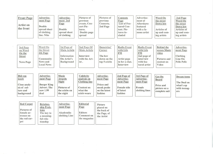
My contents Page will be a double page speard sheet with pictures of the featured articles on the first page and the second page will be content listings along with the *HHF* staff being listed on the side. The theme colours of my magazine are red and blue, and will be consistent throughout the magazine.
I will continue to work on my contents page and keep the housestyle the same throughout.
See Ya Soon, Beckford23
I will continue to work on my contents page and keep the housestyle the same throughout.
See Ya Soon, Beckford23
Subscribe to:
Posts (Atom)
