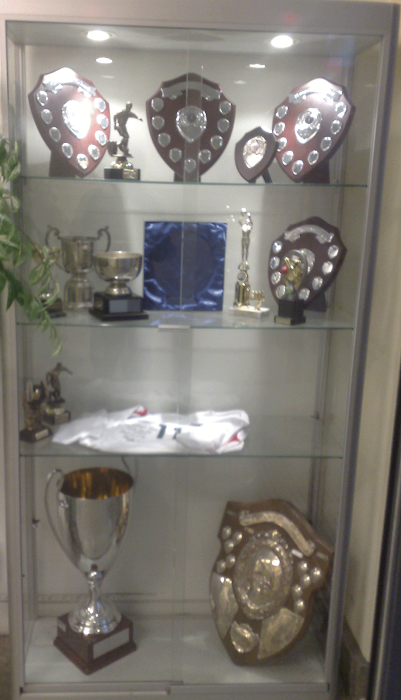
During my lesson I showed my current work to the class and got feedback on the good points and bad points of the Front Cover. During the process of this conversation I understood that the picture shows a lot about the school as well as its achievements over the years. The font and title of the school was another good point as well including the key conventions I followed. The improvements that I understood was the bottom of the front page, the idea of the heading and the sub-headiong having the same style of font didn't work to well, so for further improvements I need to look at how I can change that and make it more exclusive. In general the front cover was good, however I need to work on the bottom section of the page, making the content information more alive and conventional instead of make it look plain and simple.
In addition I will further work on this over the half term.
Beckford23
Thursday, 12 February 2009
Subscribe to:
Post Comments (Atom)


No comments:
Post a Comment