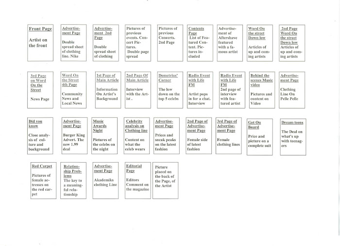
During my lesson I was given two different contents pages of a magazine, and instantly realized the differences. Both showed the same theme of colour coordination, however differed when it came to the layout. The Magazine called *Kingsize* looked more simple but with purpose and featured good quality pictures which helped to show each of the photos individuality. Whereas the other magazine has photos which didn't quite portray enough of meaning, although was the structure to the layout was good. I seemed to like the *Kingsize* magazine better because it was simple and straight forward and immediately gave me an insight on the kind of genre it was, as well as a character of who might buy it.
In conclusion, I am getting a strong understanding of how a contents page should look and what it should convey to the audience. Another thing to consider would be the colour code of the magazine and layout of the front page and contents page. It's important to consider whether of not it will look eitheir to complex or the contents page looking more like a magazine when in shouldn't.
I found that both lessons was most informative and gave my knowledge a wider view of magazines and how they should look e.g. *Housestlye*.
See Ya Soon, Beckford23
Monday, 2 March 2009
Subscribe to:
Post Comments (Atom)


No comments:
Post a Comment